 Back to RF.Spice A/D Wiki Gateway
 RF.Spice A/D Tutorial Gateway
Output Data Types in RF.Spice A/D
When you run a "Live Simulation" in RF.Spice A/D, the simulation results are typically displayed in real time using either virtual instruments or circuit animation on your schematic. At the end of RF.Spice A/D tests, the simulation results are normally displayed using graphs, tables or both. RF.Spice A/D has a powerful "Data Manager" that can generate a variety of graphs types and tables for visualizing and displaying your test results. Some virtual instruments allow you to record the simulation data during a live simulation and then plot them on a graph, too.
At the end of an analog or mixed-mode circuit simulations, the node voltages, branch currents and device powers are typically available for graphing or tabulation. Voltages, current and powers are usually plotted as a function of time or frequency. In the case of a Network Analysis test, port characteristics like scattering, impedance or admittance parameters are also computed. At the end of a digital circuit simulation, it is the state of the digital inputs and outputs that you would like to visualize.
Setting Up Circuit Observables
Even though all the circuit voltages currents are computed during a simulation, they are not automatically plotted for the obvious reason of avoiding congested and confusing graphs or enormous data tables. Therefore, you have to specify which circuit observables you would like to display at the end of a simulation. At the bottom of each Test Panel, there is a section dedicated to the specification of output results. Two checkboxes labeled "Graph" and "Table" and two buttons labeled "Preset Graph Plots" and "Preset Table Plots" are used to define all the observables to be graphed or tabulated. Both buttons open up the "Edit Plot List" dialog. You can either graph the output data or display them in tables or have it both ways. Note that the graph and table specifications are independent of each other and must be done separately.
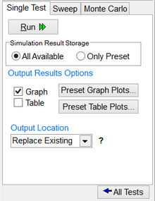 The lower section of a test panel. |
The Edit Plot List dialog consists of three tables. The table on the left shows the hierarchy for the case of multilevel signals. In the middle table (Signal Name List) you see a list of the available signals for plotting. The table on the right (Graph Name List) lists the signals to be plotted. Select one of more signals from the middle table and use the right arrow "Add-->" button to move them to the right table. You can also select more than one signal using the "Ctrl" key or a range of consecutive signals using the "Shift" key. You may modify and revise the list of the signals to be plotted by moving one or more items from the right table back to the middle table using the left arrow "<--Remove" button.
Besides voltages, currents and powers, RF.Spice A/D allows you to define, calculate and graph or tabulate new custom plots. This is done using the two buttons labeled "Add Custom Plot" and "Edit Custom Plot". Both buttons open up the "Edit Signal Plot" dialog. Here you enter a name and color for your new plot. The dialog has three tables. On the left you see a list of all the available signal names. In the middle, you see a list of all the legal mathematical functions. On the right is a list of all the legal operators. You can define your new plot using a mathematical expression involving the available signals and the legitimate mathematical functions and operations.
 The Edit Plot List dialog. |
 The Edit Signal Plot dialog. |
Using Probes or Meters as Observables
A simpler way of defining voltage and current observables is using "Probes". RF.Spice A/D provides two types of probes: Voltage Probes and Current Probes. Both can be accessed from the Schematic Toolbar at the top of the screen or by selecting "Probe Mode" in the Schematic Editor's Edit Menu. The keyboard shortcut "Ctrl+P" can be used for this purpose, too. While in the Probe Mode, you can place as many probes as you want. Voltage probes must be placed at the circuit nodes or on the wires, while current probes must be placed on a device pin. Voltage signal are always measured with respect to the circuit's ground. The direction of a current signal is determined by its underlying device pin, which shows the current's entrance into the device. The opposite figure shows a typical operational amplifier (Op-Amp) circuit with two voltage probes placed at its input and output nodes. The figure below it shows a graph of the plotted probe voltages.
 An Op-Amp circuit with two voltage probes. |
Similarly, placing voltmeters, ammeters or wattmeters in your circuit always forces RF.Spice A/D to calculate the respective voltages, currents or powers during each simulation, whether a live simulation or a predefined test.
 |
A great advantage of using probe as observables is that you can easily move them around and placed them on different nodes or pins. The graphs or tables then get updated automatically without having to run the test once again.
|
 A Cartesian graph showing the input and output voltages of the Op-Amp circuit. |
 A table displaying the input and output voltages of the Op-Amp circuit. |
Plotting Complex-Valued Signals
In AC sweep tests and other AC-types tests such as network analysis, the simulation output data are complex-valued. In this case, you have to specify whether you want to plot the magnitude or phase of a signal or its real or imaginary parts. In the case of magnitude, you have to specify whether to use dB or linear scale. In the case of phase, you have to specify whether to use degree or radian units. All of these can be done from the "Complex Signal Settings" section of the Edit Plot List dialog. This section is enabled only for tests of AC types. Alternatively, you can place special voltage or current probes with "dB", "Mag" or "Ph-deg" designations as shown in the Probe Menu on the right. The figure below shows a graph showing the magnitude of the input and output voltages of the previous Op-Amp circuit at the end of an AC sweep simulation.
 The "Complex Signal Settings" section of the Edit Plot List dialog. |
 A Cartesian graph showing the magnitude of input and output voltages of the Op-Amp circuit. |
Generating a Spectrum Graph from Time-Domain Data
With RF.Spice A/D, you can compute the Fourier Transform of your time-domain data and generate a spectrum graph. The "Transient Test Setup" dialog has an option called "Apply Fourier" that automatically creates a bar chart at the end of the simulation, showing the spectral contents of your time-domain waveform. Another option to perform a "Fast Fourier Transform" (FFT) on your data is the "Spectrum Graph" that can be accessed from the Graph View's "Special Functions" menu or from the Graph Toolbar. Unlike the transient test's Fourier bar chart, a spectrum graph is a Cartesian graph. In the transient test's Fourier Analysis, you have to specify a "Fundamental Frequency". The spectral contents of your signal are then calculated at the fundamental frequency and its harmonics (i.e. integer multiples of the fundamental frequency). In the spectrum graph, you already have time-domain data over a time window, which is usually from t = tmin to t = tmax. The fundamental frequency of the FFT is automatically calculated as f0 = 1/(tmax - tmin).
 The FFT Settings dialog for spectrum graph. |
To generate a spectrum graph, choose "Create Spectrum graph" from the Graph view's Special Functions Menu, or click the "FFT" button on the Graph Toolbar. This opens up the FFT Settings Dialog. At the top of the dialog, you have to select the "Target Signal" from a drop-down list. In the Sampling Options section of the dialog, you will see the start and stop times. You can change your temporal window if necessary. At the top of this section you can specify the "Number of Intervals" from a drop-down list with powers of 2. The default value is 512.
 A graph representing the time-domain output voltage of a diode rectifier. |
 The spectrum graph corresponding to the time-domain rectified voltage signal. |
Working with the Data on Your Plots
Graphs are displayed in a separate window called a "Graph Window" in RF.Spice A/D. To activated a graph window, click the mouse on its surface or its tab. When a graph window is active in the workspace, the menu at the top of the screen changes to the "Graph Menu", the toolbar underneath the menu bar changes to the "Graph Toolbar" and also four additional tabs are added to the Toolbox on the left of the screen. These additional tabs are Edit Plots, Tracker, Edit Axes and Edit Graph.
 The "Edit Plot" tab of Toolbox's Edit Plots panel. |
 The "Plot List" tab of Toolbox's Edit Plots panel. |
 The Toolbox's Tracker panel. |
Scaling Graph Axes
 The "Scale" tab of Toolbox's Edit Axes panel. |
 The "Title" tab of Toolbox's Edit Axes panel. |
 The "Label" tab of Toolbox's Edit Axes panel. |
 The "Place" tab of Toolbox's Edit Axes panel. |
 The "Major" tab of Toolbox's Edit Axes panel. |
 The "Minor" tab of Toolbox's Edit Axes panel. |
Customizing the Look of Graphs
 The "Basic" tab of Toolbox's Edit Graph panel. |
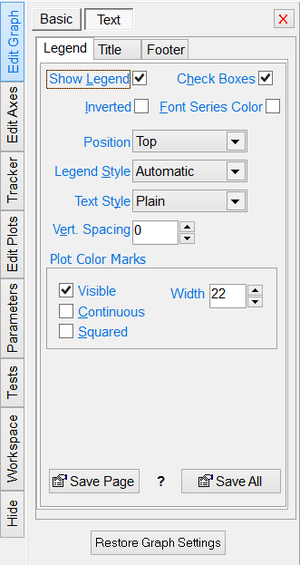 The "Text > Legend" tab of Toolbox's Edit Graph panel. |
 The "Text > Title" tab of Toolbox's Edit Graph panel. |
 The "Text > Footer" tab of Toolbox's Edit Graph panel. |
RF.Spice A/D Tutorial Gateway
Back to RF.Spice A/D Wiki Gateway


